selected works

/

conscious scroll
Conscious Scroll

Conscious Scroll

Conscious Scroll

Adding a feature

to an application

Adding a feature
to an application

Adding a feature
to an application

Conscious Scroll asks what you came for before the feed loads and keeps that answer visible while you scroll. A self-initiated concept for Instagram, taken from research to case study.

Conscious Scroll asks what you came for before the feed loads and keeps that answer visible while you scroll. A self-initiated concept for Instagram, taken from research to case study.

Role

Solo UX designer

Timeframe

4 Weeks

Type

Adding a feature to

an application

Adding a feature to an application

Adding a feature

to an application

Tools

Figma, Figmake, Maze

Figma, Figmake,

Maze

Project overview

Project overview
The problem was never that people don't know they scroll too much. It's that there is nothing in the app that makes them ask why they’re there.

Instagram has close to two billion users, with content consumption as its core experience. A third of users show signs of high-risk addictive behaviour, reporting mental fatigue, time blindness, and anxiety. The platform's own controls are passive — a reminder that's easy to dismiss — so the people who already know they scroll too much have nowhere to turn. Constant scrolling trains the algorithm on content they never chose, and the next session is worse than the last — an endless cycle.

There are two issues; people forget how long they've been scrolling, and they don't know what content they’ve been scrolling through. Conscious Scroll closes both. Before the feed loads it asks what you came for, then keeps that intention and a session timer visible while you scroll. Afterwards it shows a summary of what you content you consumed. It's built into Instagram rather than external app, so the platform trades a little raw time for something it needs more: user trust.

THE CHALLENGE

How might we give people an honest view and control of their scrolling habits, without asking Instagram to give up the engagement its business runs on?

How might we give people an honest view and control of their scrolling habits, without asking Instagram to give up the engagement its business runs on?

Goals

Goals

USER GOALS

USER GOALS
USER GOALS

Develop a healthier relationship with Instagram

Have more meaningful engagement on Instagram

Understand what content they engage with

Better manage the time spent on Instagram

Manage what content is viewed and engaged with

RESEARCH GOALS

RESEARCH GOALS
RESEARCH GOALS

Understand current app usage

Understand how users feel about their app usage

Identify issues with app usage

Determine desirability of feature

Identify time and content management tools

BUSINESS GOALS

BUSINESS GOALS

Improve user experience on Instagram

Help users better manage their time on Instagram

Create a feature that breaks short term addictive loops while not reducing long term engagement

Strengthen Instagram positioning - this is an app that cares about the well being of its users

BUSINESS GOALS

Improve user experience on Instagram

Help users better manage their time on Instagram

Create a feature that breaks short term addictive loops while not reducing long term engagement

Strengthen Instagram positioning - this is an app that cares about the well being of its users

TECHNICAL CONSIDERATIONS

TECHNICAL CONSIDERATIONS

Design a feature that matches Instagram’s design system

Privacy regulations for data tracking

The feature needs to integrate with the algorithm to help users manage the content they see

Feature prompts need to appear at the right time and in the right way visually to avoid annoyance and to be effective

TECHNICAL CONSIDERATIONS

Design a feature that matches Instagram’s design system

Privacy regulations for data tracking

The feature needs to integrate with the algorithm to help users manage the content they see

Feature prompts need to appear at the right time and in the right way visually to avoid annoyance and to be effective

My design process

My design process

A human-centred approach is taken. Every decision I make is grounded in user evidence, not assumption.

A human-centred approach is taken. Every decision I make is grounded in user evidence, not assumption.

A human-centred approach is taken. Every decision I make is grounded in user evidence, not assumption.

01

01

/

/

EMPATHIZE

EMPATHIZE

Survey, interviews, competitor analysis.

Survey, interviews, competitor analysis.

02

02

/

/

DEFINE

DEFINE

Affinity mapping, personas, statements.

03

03

/

/

IDEATE

IDEATE

Feature set, sitemap, user and task flows.

04

04

/

/

DESIGN

DESIGN

Lo-fi, mid-fi, hi-fi, prototype.

05

05

/

/

VALIDATE

VALIDATE

Unmoderated user testing, iterations.

Research

Research

I wanted to find out how users feel about their Instagram usage and the content they engage with so that I could create a feature to properly support their needs.

I wanted to find out how users feel about their Instagram usage and the content they engage with so that I could create a feature to properly support their needs.

I wanted to find out how users feel about their Instagram usage and the content they engage with so that I could create a feature to properly support their needs.

Two methods conducted. The competitor analysis identified existing products and any potential gaps that the feature could fill. The interview revealed how users felt about Instagram and what they wish they had more control over.

5

interviews, open-ended, 30 minutes each

6

competitor products analysed

Method 01

Interviews

OPEN-ENDED

30 MINUTES

5 PARTICIPANTS

Method 01
Interviews

OPEN-ENDED

30 MINUTES

5 PARTICIPANTS

Method 02

Competitor Analysis

6 COMPETITORS

SWOT ANALYSIS

Method 02
Competitor Analysis

6 COMPETITORS

SWOT ANALYSIS

Key insights

Key insights

A love hate relationship with social media.

A love hate relationship with social media.

A love hate relationship with social media.

Users all have different uses for social media, such as communication, news or entertainment but almost all of them feel depressed after use, like they waste their time, or that they are addicted.

Users want a more controlled relationship with Instagram.

Unintentional usage is a problem.

Unintentional usage is a problem.

Unintentional usage is a problem.

All respondents have used the app longer than intended before and find themselves using the app more than they want throughout the day.

The idea of setting an intention upon opening the app can help prevent this and improve the user’s outlook on their usage.

Content influences behaviour and feelings.

Content influences behaviour and feelings.

Content influences behaviour and feelings.

News leads to strong engagement but can make users feel negative.
Reels and short form content is addictive.
Positive and funny content improves the experience.
Random AI content or upsetting content pushes people away.

This creates an opportunity for content awareness and reflection in the feature.

Users want control over their algorithm.

Users want control over their algorithm.

Users want control over their algorithm.

Several respondents repeated that they want more control over what they see and that it frustrates them when they see irrelevant content. The algorithm controls them, when they want control over it.


The feature’s content settings can help influence the algorithm.

Personas

Personas

Amber

Amber

Age: 24

Occupation: Waitress

Gender: Female

Location: South Africa

BIO

Amber uses Instagram daily as a way to unwind, pass time, and escape boredom. What starts as a quick check-in often turns into long, unintentional scrolling sessions. While she enjoys light content like funny videos and recipes, she often finishes using the app feeling like she’s wasted time and gained little value.

BEHAVIOURS

Opens Instagram multiple times a day, consumes Reels and passive content, rarely posts or engages actively, usage is fuelled by boredom, loses track of time while scrolling.

CHALLENGES

Mindless scrolling habits, feels unproductive after long sessions, struggles to stop once she starts, screen-time tools don’t work.

NEEDS

Gentle reminders during scrolling, awareness of time spent in the moment, a way to break out of autopilot behaviour.

“It really is just a matter of habit at this point. I don’t even mean to open the app, my fingers just automatically click the button.”

Alexander

Alexander

Age: 38

Occupation: Creative director

Gender: Male

Location: South Africa

BIO

Alexander actively engages with Instagram as both a social and informational platform. He follows news, cultural content, and topics he cares about, but is highly aware of how the algorithm shapes his experience. While he values the platform, he is critical of its addictive nature and the emotional impact of the content he consumes.

BEHAVIOURS

Active and passive usage, curates his feed intentionally, checks screen time occasionally, uses Instagram for both connection and information.

CHALLENGES

Algorithm pushing unwanted content, emotional impact of certain topics, feels conflicted about time spent vs value gained, limited control over feed and recommendations.

NEEDS

Transparency of content consumption, control over algorithm, insight into how content affects him

“When my feed is flooded with negative headlines it overwhelms me. Sometimes I close the app wishing I never opened it.”

User flows

User flows

Mapping out the primary flows before touching pixels ensured the logic was sound. Three flows were defined for MVP scope.

Mapping out the primary flows before touching pixels ensured the logic was sound. Three flows were defined for MVP scope.

Mapping out the primary flows before touching pixels ensured the logic was sound. Three flows were defined for MVP scope.

Lo-fi & mid-fi
Low-fidelity sketches established layout logic without attachment to any serious design or hours spent. Once I decided on a structure, I moved on to creating mid-fidelity in Figma.

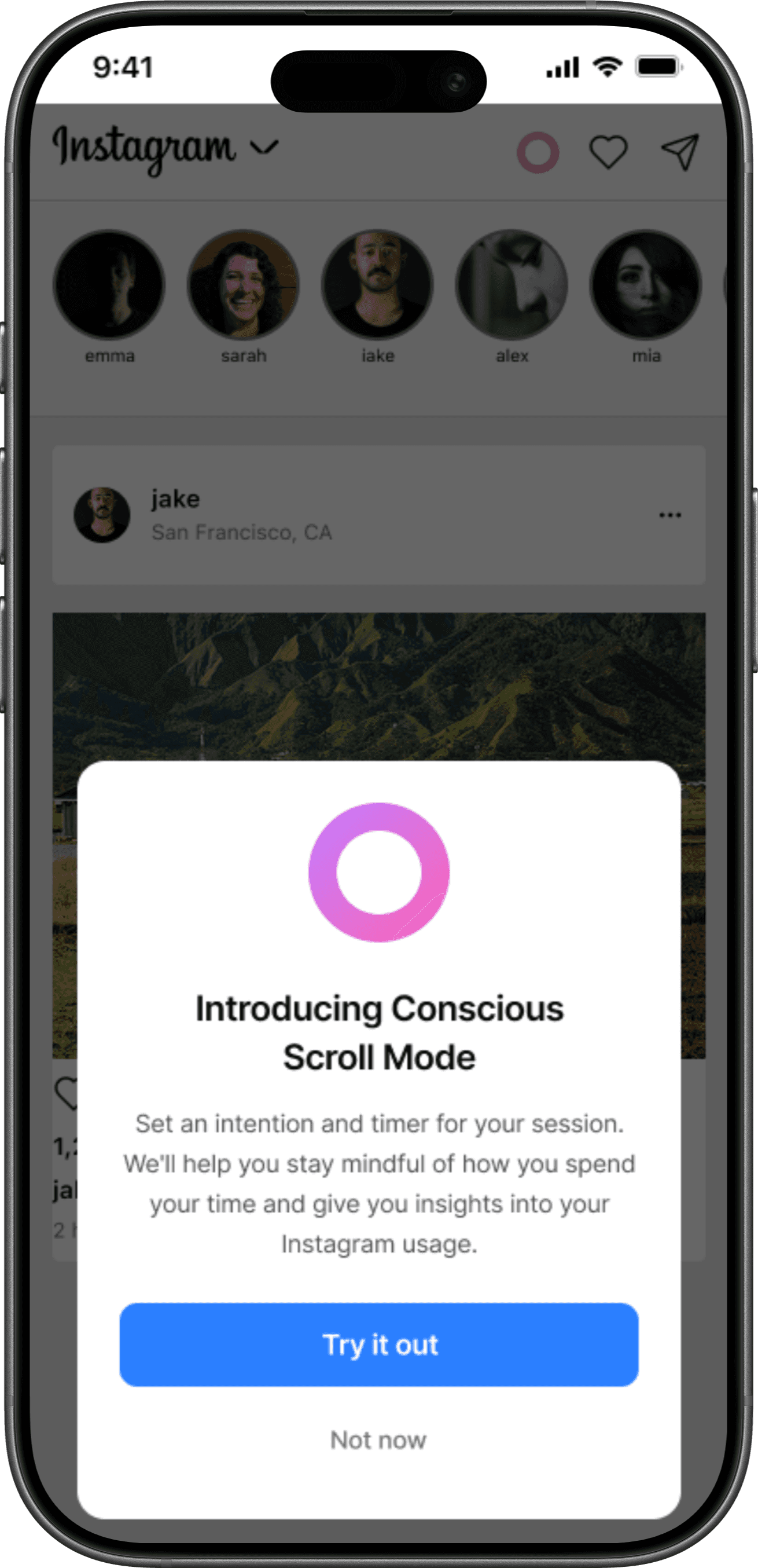
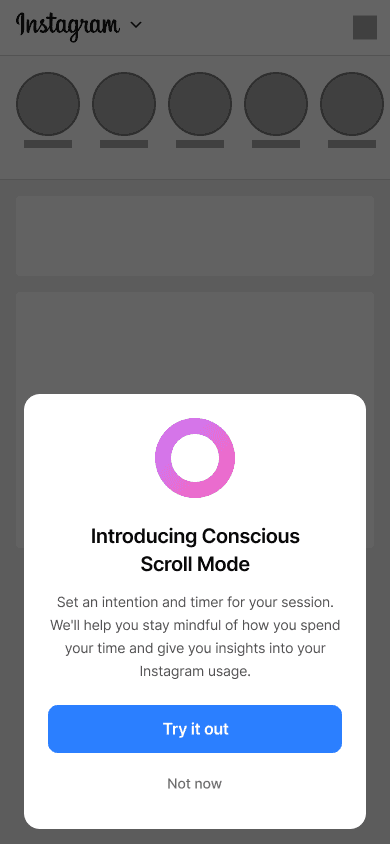
POP-UP

This will make users aware of the new feature and encourage use.

TIMER & INTENTION SETTING

An intention and time will help prevent mindless scrolling — the first step to understanding usage.

PROGRESS BAR

Serves as a gentle reminder of their initial intention and the time limit they selected.

REFLECTIVE SUMMARY

Initially only a section of the page will be revealed, it’s up to the user if they want to view more.

FULL REFLECTIVE SUMMARY

Users are given a full breakdown of their time and content. At the end there are content settings.

CONSCIOUS SCROLL ANALYTICS

Part of a different flow, this was the initial idea for the analytics page.

Lo-fi & mid-fi

Low-fidelity sketches established layout logic without attachment to any serious design or hours spent. Once I decided on a structure, I moved on to creating mid-fidelity in Figma.

POP-UP

This will make users aware of the new feature and encourage use.

TIMER & INTENTION

SETTING

An intention and time will help prevent mindless scrolling — the first step to understanding usage.

PROGRESS BAR

Serves as a gentle reminder of their initial intention and the time limit they selected.

REFLECTIVE SUMMARY

Initially only a section of the page will be revealed, it’s up to the user if they want to view more.

FULL REFLECTIVE SUMMARY

Users are given a full breakdown of their time and content. At the end there are content settings.

CONSCIOUS SCROLL ANALYTICS

Part of a different flow, this was the initial idea for the analytics page.

Lo-fi & mid-fi

Low-fidelity sketches established layout logic without attachment to any serious design or hours spent. Once I decided on a structure, I moved on to creating mid-fidelity in Figma.

POP-UP

This will make users aware of the new feature and encourage use.

TIMER & INTENTION SETTING

An intention and time will help prevent mindless scrolling — the first step to understanding usage.

PROGRESS BAR

Serves as a gentle reminder of their initial intention and the time limit they selected.

REFLECTIVE SUMMARY

Initially only a section of the page will be revealed, it’s up to the user if they want to view more.

FULL REFLECTIVE SUMMARY

Users are given a full breakdown of their time and content. At the end there are content settings.

CONSCIOUS SCROLL ANALYTICS

Part of a different flow, this was the initial idea for the analytics page.

High fidelity & prototype

High fidelity & prototype

High fidelity & prototype

Once the structure and flows were validated, high-fidelity screens were designed applying the full visual style of Instagram’s current UI.


A clickable prototype was built in Figma covering my primary flows. These prototypes were used in my usability testing sessions, giving testers realistic task completion.

FLOW 1 & 2 — THE MAIN EXPERIENCE

Here flow one and two can be seen together as they make up the main feature experience.

FLOW 3 — ACCESSING ANALYTICS

Conscious scroll analytics can be found in settings, users can view what kind of data will be displayed when the feature is launched.

Usability testing

Usability testing

Unmoderated, remote usability tests were conducted using Maze. Two tests were sent out, one for each flow. Users were asked to navigate through the prototypes and afterwards they were asked a series of questions about their experience.

Unmoderated, remote usability tests were conducted using Maze. Two tests were sent out, one for each flow. Users were asked to navigate through the prototypes and afterwards they were asked a series of questions about their experience.

Task 1: Navigate through the feature

Task 1: Navigate through the feature

Overview

Overview

User flows 1 and 2 were combined for this test. Users were asked to simply navigate through the feature. I kept the goal broad for this test as my main goal was to determine the functionality and desirability of the feature.

Task Given

Task Given

Navigate through the Conscious Scroll feature.

UI match

UI match

75% of respondents agree that the UI matches Instagram’s current interface.

Avg time on task

Avg time on task

70 seconds

Ease of use

Ease of use

75% of respondents stated the feature was intuitive the use.

Desirability

Desirability

100% of respondents stated they would use the feature.


“Loved the feature! It gives users way more insight and control over their social media consumption which is honestly much needed.”

Success of all elements

Success of all elements

The timer on the ‘Progress Bar’ page caused anxiety, respondents want more content moderation settings on the ‘Reflective Summary’ page, and they would like more intention options.


“I dislike the timer at the top, it creates a nervousness and unwanted stress to something that shouldn't feel like that but having said that I’m not sure what’s a better way of indicating the time remaining as shifting to a message informing me of such would not help either.”

Task 2: Find a recipe

Task 2: Find a recipe

Overview

Overview

Users were asked to access their Conscious Scroll analytics. The goal of this test was to determine if users could easily find the analytics page and whether all the data presented was useful.

Task Given

Task Given

Navigate to Conscious Scroll analytics and review the page.

UI match

UI match

All respondents agree that the UI of the feature matches Instagram’s current interface.

Avg time on task

Avg time on task

73 seconds.

Ease of use

Ease of use

Some participants were confused by the data presented on the analytics page. One user was unsure what ‘Most viewed’ referred to, their profile or other profiles. Not enough users reported this being a problem to take extensive action. 


“I just need a clear understanding on the "Most Viewed" session. Does it cover views of my profile or it's data of accounts that I viewed?”

Desirability

Desirability

100% of respondents stated they would use the feature.


“I like the concept of the app and it could be great in understanding of how we use social media.”

Success of all elements

Success of all elements

Users found all elements useful, making them successful.

Iterations

Iterations

Usability testing revealed several changes had to be made to the main feature flow. I removed the timer that accompanied the progress bar, I added more content moderation settings on the Reflective Summary page, and finally I added more intention options.

Usability testing revealed several changes had to be made to the main feature flow. I removed the timer that accompanied the progress bar, I added more content moderation settings on the Reflective Summary page, and finally I added more intention options.

Usability testing revealed several changes had to be made to the main feature flow. I removed the timer that accompanied the progress bar, I added more content moderation settings on the Reflective Summary page, and finally I added more intention options.

BEFORE

AFTER

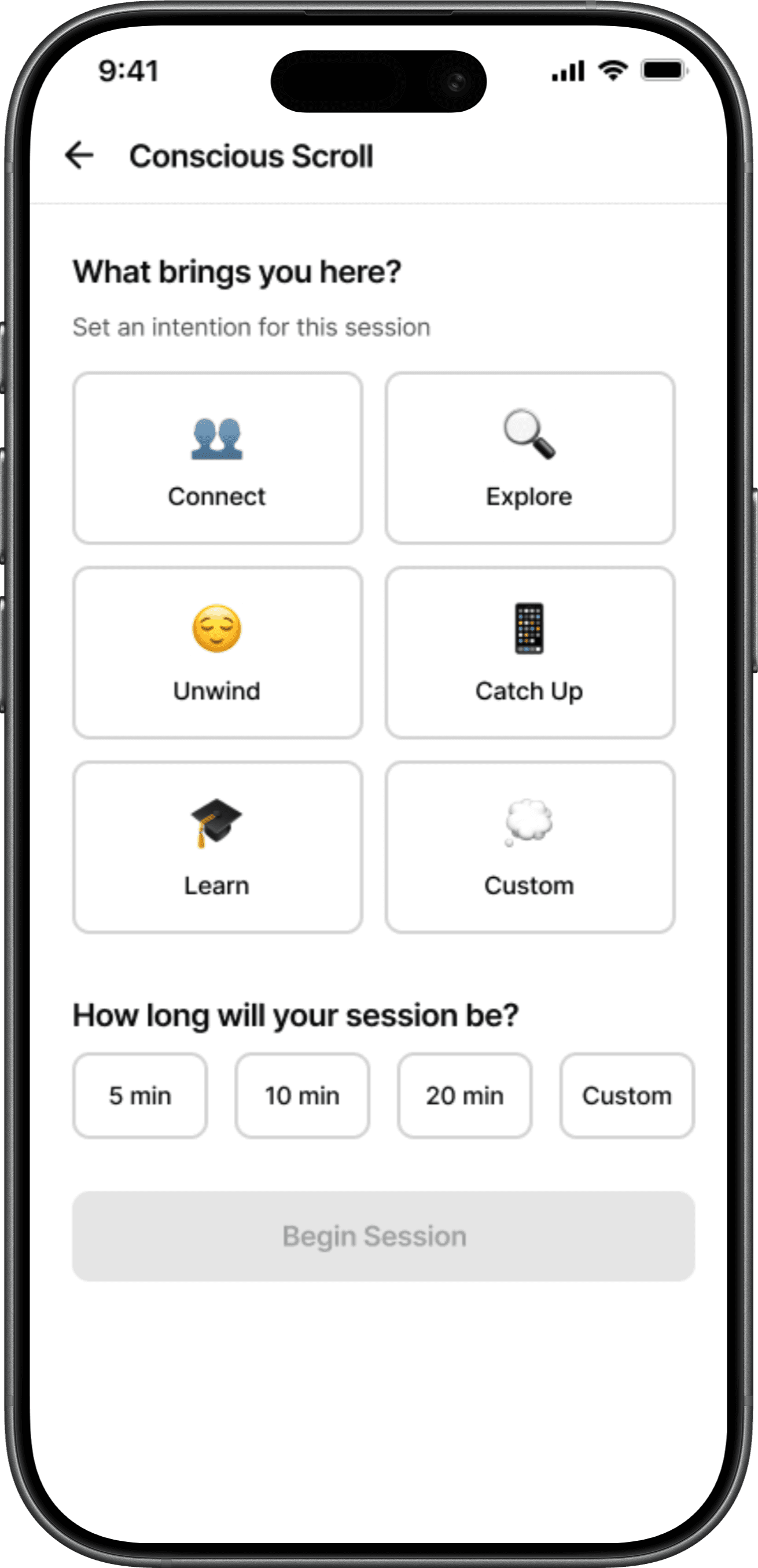
INTENTION OPTIONS

A new intention was added to give users more options. A custom intention option was also added, here users can type any intention they want.

BEFORE

AFTER

PROGRESS BAR

I removed the intention reminder and the count down timer. Only the progress bar remained. This is more subtle and the goal is to decrease the anxiety some users reported from the timer.
BEFORE

AFTER

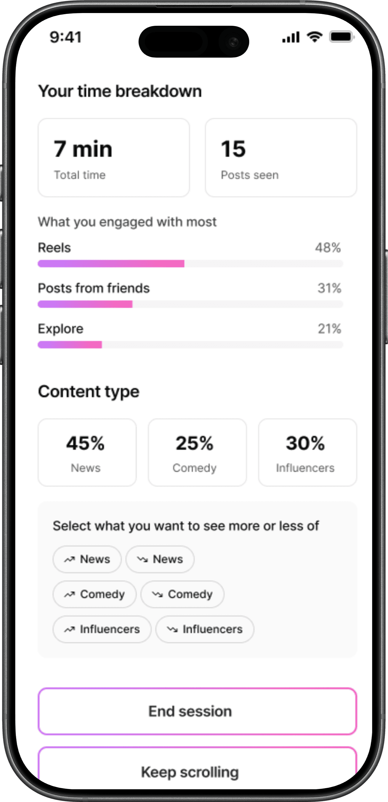
CONTENT MODERATION SETTINGS

Users wanted more content moderation settings in the reflective summary. I added the ability to block certain topics.

Reflections & take aways

Reflections & take aways

A feature is only as good as the intent behind it.

A feature is only as good as the intent
behind it.
A feature is only as good as the intent behind it.

I chose this brief because social media time management is something I've struggled with, and I assumed that made it a narrow problem. The research said otherwise. People wanted more control over what they saw, better tools for managing time, and more transparency from the platform. The most useful thing I took from the project was learning to treat that research as a live reference rather than a phase I'd completed. The personas and interview findings became something I returned to at every stage, and whenever a design decision felt uncertain, going back to them settled it faster than reasoning it out alone.

The second lesson was about intent. Instagram already ships a screen time tool and third-party apps have offered limits for years, yet people ignore all of them. What made Conscious Scroll different was asking why someone opened the app rather than only how long they stayed, and keeping that distinction at the centre of every decision. Every respondent said they would use the feature, which tells me the framing landed.

WHAT WORKED

Returning to the personas resolved uncertain decisions faster than debating them in the abstract.

Designing inside Instagram rather than alongside it. Keeping the platform's business model in scope meant the concept had to earn its place, not just help the user.

WHAT I WOULD CHANGE

Asking "would you use this" reliably returns a yes, especially from people who already feel bad about scrolling.

I recruited people who already knew they overused the app. That's the group most likely to welcome the idea.

FUTURE ITERATIONS

Test the prompt with people who don't identify as overusers, run a behavioural study over a week rather than a stated-preference survey, and design the content summary properly — including what the app should do when someone's stated intention and actual session clearly diverge.

Test the prompt with people who don't identify as overusers, run a behavioural study over a week rather than a stated-preference survey, and design the content summary properly — including what the app should do when someone's stated intention and actual session clearly diverge.

NEXT CASE STUDY

Pantry

NEXT CASE STUDY

Pantry

NEXT CASE STUDY

Pantry