selected works
/
pantry


Role
Solo UX designer
Timeframe
8 Weeks
Type
Tools
Pantry started from a small annoyance. You have half a cabbage, two eggs and a tin of chickpeas, and every recipe app wants you to pick a cuisine first. The gap between what is on the shelf and what the app shows you is where users resort to takeout.
The concept is ingredient first. You tell the app what you already have and it ranks recipes by how close you are to being able to cook them rather than by how popular they are. Everything after that is about keeping the list honest: showing what is missing, how long it takes, and whether it’s worth a trip to the shop.
THE CHALLENGE
How might we help people cook what they already have, without turning the app into an inventory chore they want to abandon by day three?
Know what to cook in the moment
Move past missing ingredients
Cook with what they already have
Reduce food waste with low effort
Feel more capable in the kitchen
Identify core user need
Identify a gap in the market through competitive analysis
Identify current tools used by participants
Understand participants’ ingredient handling
Ingredient matching algorithm
Recipe database
Saved pantry and user preferences
Mobile first and offline capabilities
Affinity mapping, personas, statements.
Feature set, sitemap, user and task flows.
Lo-fi, mid-fi, hi-fi, prototype.
Unmoderated user testing, iterations.
Three methods over three weeks, run in sequence so each could support the next. The survey found the pattern, the interviews explained it, and the competitive analysis checked whether anyone had already solved it. Open the methods below to see how it was run.
18
survey responses, mixed participants
5
interviews, open-ended, 30 minutes each
4
competitor products analysed
All participants have trouble with deciding what to cook but for different reasons. Some lack confidence and intuition, others lacks inspiration and time. Participants noted a lack time, missing ingredients, improper planning as blockers leading to the decision fatigue problem.
Pantry must serve all these entry points.
Not having the right ingredients on hand emerged as a major friction point for all participants. This causes them to abandon recipes entirely, buy extra ingredients that go unused, or simply order out.
Pantry needs to provide different solutions to this problem.
Participants plan differently. While some are spontaneous, others plan thoroughly, and a few sit in the middle. This creates a design challenge, a meal plan first flow will alienate some of the spontaneous users while a loose unstructured approach will frustrate the planners.
Pantry needs to be flexible and customisable to unique needs.
The spontaneous cooks wastes food several times a week while the organised planners waste very little as they shop with intent. This creates a natural narrative: Pantry helps spontaneous cooks behave more like planners, without forcing them to become one.
Pantry can aid in food waste reduction.

Age: 34
Occupation: Marketer
Reluctant cook
Reactive planner
2 person household
Weekly food waste
BIO
Leila has a busy work and personal schedule. She cooks out of necessity — to save money and eat healthy. Evenings are reactive: she feels a mix of overwhelm and indecision before defaulting to UberEats. She struggles to connect what she has to what she can actually make. She's not a bad cook — she struggles to improvise.
BEHAVIOURS
Opens the fridge with no plan, buys groceries impulsively, defaults to the same 3-4 meals.
CHALLENGES
No cooking intuition, high cognitive load after work days, wastes food because she shops without a plan, recipe sites assume she knows what she wants.
NEEDS
Instant direction on what to make in the moment, short and simple recipes, Sunday plan so weeknights are less chaotic.
"I have food in the fridge — I just never know what to do with it. By the time I've figured it out I've already ordered.

Age: 38
Occupation: Designer
Cooks from memory
Improvisor
1 person household
Occasional food waste
BIO
Marcus is a confident cook who enjoys making food. He doesn't follow recipes, he tries to build a dish from ingredients he has. His biggest pain point is inspiration. He abandons potential meals for lack of one ingredient, wastes produce he bought with good intentions, and occasionally ends up eating toast.
BEHAVIOURS
Does a fridge recon before cooking, starts with a base ingredient and builds outward, cooks from memory.
CHALLENGES
Recipe abandonment when one ingredient is missing, existing apps are too inspirational not functional, runs out of ideas and repeats recipes.
NEEDS
Inspiration when his mental repertoire runs out, a solutions when he’s missing an ingredient, a functional tool.
"I know how to cook — I just run out of ideas for what I have. And if I'm missing one thing, I usually just give up on the whole meal."


I started with low-fidelity sketches to settle the design’s structure before anything got color and content. Mid-fidelity saw the primary flows mapped out with colour and most content added.


A warm and simple interface aims to be inviting and avoid anxiety when users decide to cook.
Click to play any of the three user flows below.
ONBOARDING
FIND A RECIPE
MEAL PLANNER
You've just downloaded a new app called Pantry. The app was recommended to you by a friend — it helps you figure out what to cook using ingredients you already have at home. This is the first time you've opened it.
Create your account and complete the onboarding steps. Stop when you reach the user dashboard.
100%
89 seconds. This is a satisfactory time considering the flow had lots of reading and pages to navigate through.
5 out of 5 users strongly agreed that they understood what each page was asking them to do and the flow was intuitive and easy to navigate through.
5 out of 5 participants stated they would complete the full onboarding process given this was a real app.
‘I would've definitely completed the full setup.
Reasons: 1 — it's easy and well designed.
2 — Because the more pantry staples I add the better recipes I'll get.’
It's a weekday evening and you only have a few ingredients at home. You want to cook dinner with what you already have — you don't want to go to the shops.
Navigate through all the pages involved in finding, picking, and cooking a recipe.
100%
114 seconds
3 out 5 participants were unsure how to get to the ingredient entry page.
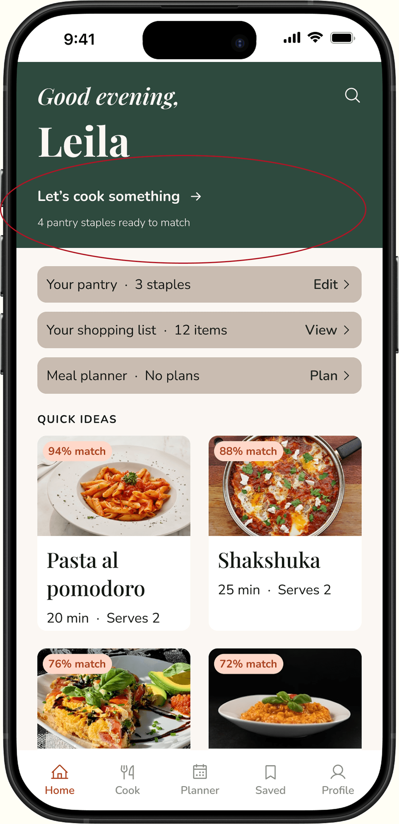
‘It was not clear how to find a recipe. I intuitively started to click on the suggested recipes first instead of the green bar above as it seems like a decorative header and not a prompt.’
All participants stated they would go through this process on a normal night if they were unsure of what to cook.
It's Sunday evening and you want to plan your meals for the upcoming week and create a shopping list.
Use the meal planner to create a weekly meal plan, then build a
shopping list from the meals selected and check items off.
100%
71.1 seconds
There was no confusion for users.
‘Seeing the recipe name under the shopping list item was a bit weird, I don't think you necessarily need to know which ingredient you are buying is for which recipe as long as you have the items on the list.’
There was no confusion for users.
All users found the meal planner and shopping list feature useful.
BEFORE

AFTER
FIND A RECIPE BUTTON
The words were underlined and the caption removed to clearly indicate this is a button. The wording was also changed to make it clear where the button would take users.

BEFORE

AFTER
CARD COLOUR CHANGE
The recipe step cards’ colour was changes to improve readability and visual hierarchy. The visual change between the cards and the pill selection for steps and ingredients above is subtle but necessary.
The people who default to takeout don't need better recipes — they need a clear starting point. This shaped the entire approach: the ingredient-first entry, the match percentage framing, the pantry staples concept, the auto-suggest planner. These features are not simply there because I thought they would be nice to have. They are there to solve user problems of inspiration, food waste, and disorganisation.
Working through every phase as a solo designer taught me that clarity at one stage makes the next stage easier. The clearer the research synthesis, the easier the flow design. The clearer the flows, the faster the wireframes. Every ambiguity you carry forward costs more later.
WHAT WORKED
Defining task success before testing meant testing results could not be argued away afterwards.
Sketching lo-fi screens before designing anything on Figma helped me map out the logic of flows early.
The competitor analysis gave the concept reason to exist beyond my own idea of its usefulness.
WHAT I WOULD CHANGE
Conduct moderated test to have an open dialogue with participants in real time.
I would test different brand variations — I had several colour and typography options — to see which users respond best to.
I would send the survey out on more channels to have a more diverse and larger pool of respondents.
FUTURE ITERATIONS