selected works
/
kitravia

Role
UX designer on a team of 3, dashboard design lead
Timeframe
5 Weeks
Type
Mobile and desktop website redesign
Tools
Figma, Figmake, Maze, Claude Design
Kitravia is an AI-powered travel agency that lets travellers plan, compare, and book entire trips through a conversational interface. The ambition goes past competitors: an assistant that understands natural language, remembers preferences, and handles everything from flights to visa documentation in one place. The technology delivered on that. The website didn't. Fragmented navigation, a broken mobile experience, and no visible trust signals meant new users had little reason to believe the product worked, let alone book with it.
I worked in a three-person team across a five-week accelerated sprint, leading the research synthesis and owning the design of all the user dashboards — traveller, partner, and admin. My teammates covered the homepage, AI search, booking flow, and onboarding. The redesign gave the interface a single navigation system, a mobile experience that put the AI chat where a phone user would actually find it, and a visual language consistent enough to make the underlying intelligence believable.
THE CHALLENGE
We audited the current website before we designed anything. I ran a heuristic evaluation of the live site against Nielsen's ten heuristics, documenting every finding, then set the results against a competitive analysis of four major OTAs. Interviews with the target audience were conducted. Finally, an updated site map was created. The audit told us what was broken. The competitive analysis told us whether fixing it would be enough to matter. The interviews told us what users really needed from the product. The site map gave us direction.
38
issues found during the website audit
6
interviews, open-ended, 30 minutes each
4
competitor products analysed
All participants use more than one platform or information source during a booking session. Even those who described themselves as loyal to one platform (e.g. Booking.com) admitted to cross-checking hotel websites or running parallel searches. The cognitive burden of managing this fragmentation is a shared pain point.
Family travellers, work travellers with specific constraints, and experiential travellers all hit the same wall: standard platform filters don't go deep enough. This forces manual review-scanning, which is time-consuming and unreliable.
Every participant expressed openness to AI-assisted travel planning. However, the level of autonomy they were comfortable granting the AI varied significantly. The common thread was: users want to remain in control of decisions, especially financial ones. AI should augment the process, not remove human agency.
Participants reacted positively to the concept and the AI-centric positioning. However, the current execution has credibility gaps that prevent them from trusting it with a real booking. Several critical UX issues were identified without prompting.

Age: 34
Occupation: Product manager
B2C traveler
Budget: Mid-range
Travels for work + family
5-6 trips a year
BIO
Nadia plans her own trips for work and her family's holidays. She compares three or four sites every single booking — deeply skeptical that any one platform shows her the best deal. She's used ChatGPT to shortlist destinations and was impressed by the speed, but she's not about to give over banking information to an AI. She wants help filtering and curating — not deciding for her.
BEHAVIOURS
Cross-checks prices, reads reviews before booking stays, uses AI to shortlist destinations, books in advance.
CHALLENGES
Generic filters miss unique needs, AI doesn’t fully understand her needs, cross-checking tabs across sites becomes frustrating.
NEEDS FROM KITRAVIA
Multi-itinerary AI output, decision gate before payment, family/group filters, unified post-booking hub for docs.

Age: 47
Occupation: Hotel owner
Property size: 32 rooms
B2B partner
Location: Cape Town
Platforms: Booking, Expedia
own website
BIO
Marcus and his wife run a boutique hotel in Cape Town. He operates across Booking.com, Expedia, and his own site — and resents how much commission he pays. He wants faster review notifications, clearer revenue trends, and a way to run promotions himself without depending on a marketing agency.
BEHAVIOURS
Checks bookings and inbox daily, replies personally to all reviews, runs promotions by himself.
CHALLENGES
High OTA commissions eat margin, promotion tools are complex on current platforms, no visibility into who his guests are.
NEEDS FROM KITRAVIA
Real-time analytics, optimised review management, promotion templates.

Age: 29
Occupation: Customer operations lead
Responsible for Kitravia customer support
Super admin
BIO
Caroline joined Kitravia from a fintech support team. She's responsible for service-level agreements compliance, refund processing, and partner escalations. Her day swings between managing a queue and digging into edge-case bookings to figure out what went wrong. She's the calmest person in the room when something breaks— but she's tired of stitching context together from three separate tools
BEHAVIOURS
Handles all partner and customer disputes, manages refunds, reviews purchase orders.
CHALLENGES
Doesn’t have one tool for all tasks, no single view of system health, refunds need multi-system approvals.
NEEDS FROM KITRAVIA
Single tool for users, bookings, and tickets, one-click actions, live system health and ticket queue, audit trail of admin actions.

The B2C dashboard for mobile and desktop were prioritised for this project and will mostly be what is discussed for the remainder of this case study. Due to time and testing sample limitations, it made sense to prioritise the B2C dashboards as we could test and validate these designs. For this reason, I only created a UI design for the Partner and Admin dashboard with minimal interaction between elements. This was noted to client for future work and iterations.


TRAVELER DASHBOARD (B2C)
PARTNER DASHBOARD (B2B)
ADMIN DASHBOARD


You're packing for your Cape Town trip. Your partner wants to know your flight number for your return journey. Find it on the user dashboard.
Navigate to where you will find a flight number for your return journey from Cape Town to London.
100%
384 seconds
Mixed reviews. No users found it particularly challenging but one rated ease of use 2/5.
‘After clicking the "My trip" button, I easily found my return trip information on the page page with both departure and returns.’
Before your Tokyo trip, you saved a travel guide called Tokyo Explorer. You want to remind yourself what the first thing on the itinerary is.
Find your first itinerary item in your saved guide - Tokyo Explorer.
100%
31 seconds
All users found this task easy. 2 out of 3 participants rated it a 5/5 in ease of use.
You'd like to upgrade your Kitravia subscription plan. Navigate to where you would do that.
Find the subscription settings in the user dashboard.
100%
113 seconds
All users found this task easy. 2 out of 3 participants rated it a 5/5 in ease of use.
Users were asked a series of questions about universal dashboard components and their overall experience.
All users were sure they were in the right place at all times.
‘No, it was simple to follow.’
All users found the left navigation menu to be sufficient in navigating around the dashboard.
‘The main dashboard is clear and concise along the directions.’
Overall no users found the dashboard to be lacking anything.
67% rated it five and 33% rated it 4.
Most changes were made by client request as the usability testing proved highly successful and required no major changes.
DASHBOARD OVERVIEW
An AI search bar that is used on the home page of the website was added by client request. This allows users to plan a new trip and gives a constant reminder of Kitravia’s main feature.
The ‘My trips’ card colours were updated.

BEFORE
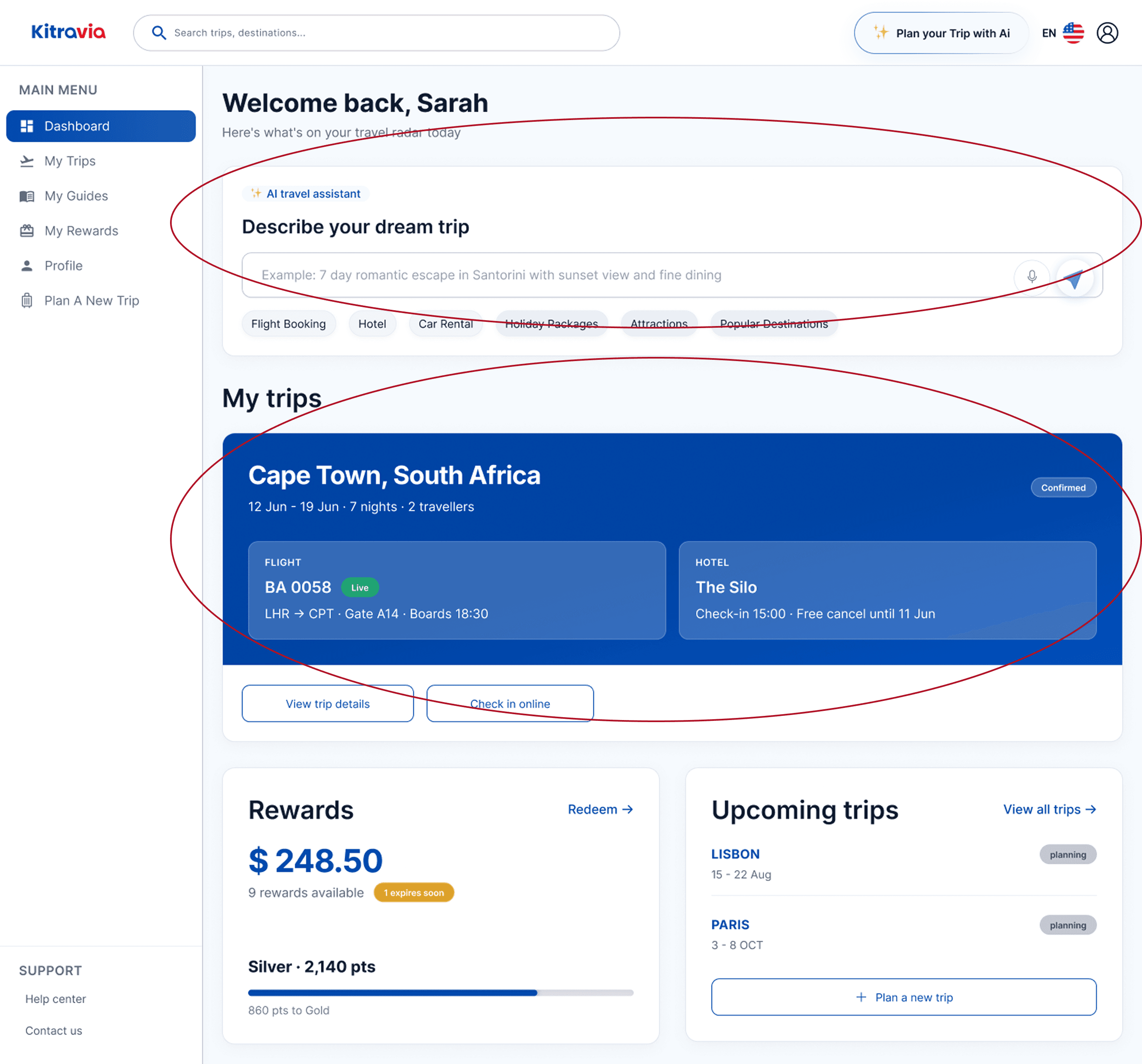
AFTER
MY TRIPS
The AI search bar was also added here by client request. Trying to keep the main function of Kitravia front of mind as much as possible.

BEFORE

AFTER
MY GUIDES
The design was updated to match the design one of my team mates did on the home page flow.

BEFORE

AFTER
The volume of the design brief was daunting at first — three dashboard across different user groups in five weeks. This meant I had to prioritise and be realistic about what I can design, test, and prove in that time. Early on I decided to put the focus on the Traveller Dashboard, because it was the only one I could realistically test with the participants available to me. That meant the admin and partner dashboards would take a backseat and only get a UI design to match the overall design system. I raised this with the client early on got agreement rather than just assuming and heading off in my own direction.
One lesson that carried of a lot weight for me is how important a shared design system is in a team where everyone is working on a different feature. Working from fixed tokens — colour, type scale, radius, spacing — meant all three team mates designed cohesive features for the client. It also helped me build three dashboards, made for entirely different users, still read as one product.
FUTURE ITERATIONS
Usability testing for the Partner Dashboard with real hotel owners
The remaining Super Admin pages built from the existing component set.
Error state variants built across trip detail and booking management
A WCAG 2.1 AA audit before sign-off.
KEY INSIGHT
A five-week sprint doesn't reward fitting everything in. It rewards choosing what to cut, agreeing that cut with the client, and documenting it clearly enough that the next person loses no time picking it up.